Writing Storybook Stories for Button Components
A button is the simplest component in any design system. It's also the one most likely to have 15 variants, 4 sizes, 3 states, and a dozen edge cases nobo...
29 Apr 2024
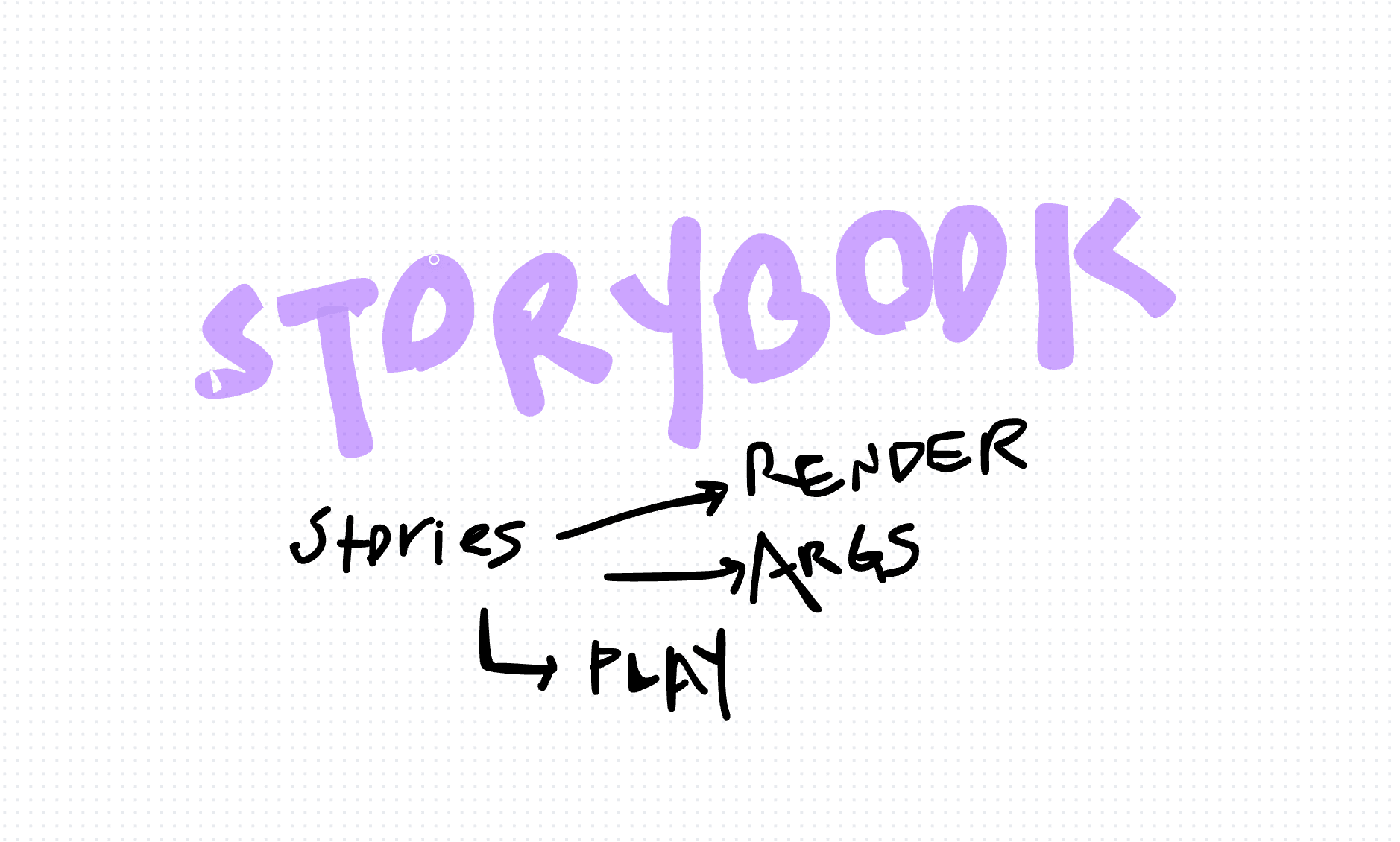
A button is the simplest component in any design system. It's also the one most likely to have 15 variants, 4 sizes, 3 states, and a dozen edge cases nobody documented. Storybook fixes that.
Storybook renders your components in isolation. Each "story" is a specific state of a component. You see every variant, every edge case, without booting your entire application.
Writing stories with TypeScript
Here's a complete example for a button component using the Component Story Format (CSF3):
import type { Meta, StoryObj } from "@storybook/react"
import { Button } from "./Button"

const meta: Meta<typeof Button> = {
  title: "Components/Button",
  component: Button,
  argTypes: {
    variant: {
      control: "select",
      options: ["primary", "secondary", "danger"],
    },
    size: {
      control: "select",
      options: ["small", "medium", "large"],
    },
    disabled: { control: "boolean" },
  },
}

export default meta
type Story = StoryObj<typeof Button>

export const Primary: Story = {
  args: {
    variant: "primary",
    children: "Primary Button",
  },
}

export const Secondary: Story = {
  args: {
    variant: "secondary",
    children: "Secondary Button",
  },
}

export const Disabled: Story = {
  args: {
    variant: "primary",
    children: "Disabled",
    disabled: true,
  },
}

export const Small: Story = {
  args: {
    variant: "primary",
    size: "small",
    children: "Small Button",
  },
}
Each exported object is a story. The args define the props passed to the component. Storybook generates interactive controls from argTypes, so anyone can tweak props in the UI without editing code.
Why this matters
Stories serve as living documentation. New developers see every button state without reading code. Designers verify that implementations match their designs. QA sees edge cases without navigating through the app.
Stories also work as visual regression tests. Tools like Chromatic snapshot every story and flag visual changes. A CSS change that accidentally breaks a button's hover state gets caught before it ships.
The trade-offs
Storybook adds build complexity and maintenance overhead. Stories need to stay in sync with your components. If a prop changes and the story isn't updated, you get broken stories that erode trust in the tool.
It also adds dependencies. Storybook's ecosystem is large and the upgrade path between major versions can be rough.
For design systems and shared component libraries, the investment pays for itself. For a small app with a handful of components, the overhead might not be worth it. Write stories for the components that other people consume. Skip them for one-off internal components.
AI Transformation for Organisational Leaders
For directors, heads of function and founders: eight live evening sessions with Ehsan Gazar and Anoosh Zeighami, ending with a one-page 2027 AI plan for your organisation, built on a real workflow and ready for your leadership team.
$1,495, or $1,045 with code EARLYBIRD until 23 Oct.
View the live cohort